

References from Unsplash.
References from Unsplash.
(Reposting from my Mastodon account, because I think peeps will find it useful)
Upon reading about the way loot boxes mimic gambling I stumbled upon https://gamequitters.com/
Since them, I’ve been musing about how much compy/tablet time I’m using when I could be producing or practicing something lasting.
My argument for playing single-player games is that everything I take in is grist for the mill (inspiration for art or writing). I feel like if I stop, I could overfish my creative well. But I also don’t want to waste my time as a watcher and not a doer. And sometimes social media and seeing everyone’s art saps energy.
The most MP game I play is Armello, but I think I’ll delete it [EDIT: since this post, I did that and deleted a few card games that I was spending too much time on].
I think Game Quitters is very savvy though–that factors that make people turn to gaming (or other not-so-productive behaviors) are:
I could use more of IRL sociality. I feel like writing and art give me plenty of challenge and a sense of progress but other psychological things make me feel like I’M NEVER GOOD ENOUGH so there’s that, too.
(From a comment over at CoverCritics.com)
“I think this cover would not pass my test of imagining it with a title in an unfamiliar language. If you were to do that, would you still be able to tell anything at all about the nature, themes or even genre of the book?”
That’s a great idea. If everything about your book cover was the same (pics, typefaces) but the words were foreign/lorem ipsum, what assumptions would your viewer make?
![]() …is certainly not skulking around corners!
…is certainly not skulking around corners!
A friend of mine wrote a postmodern hypertext (like, CYOA) eBook called LOVE OCTOPUS TRANSFORMATION. My sketch has been on its cover for years now, but since I’ve learned more about eyecatching book cover design, I wanted to update it and make it purdy for her.
Here’s the before:
 The test of a good eBook cover: does it catch audience interest? Does it signal the genre?
My old errors: I stretched the text, and you can’t figure out what the illio is in the thumbnail. Genre, what’s that?
Here comes the AFTER!


A mashup of CC-0 photos, a little Krita magic, and surprisingly little futzing in Inkscape for the text!
This one might be a little fantastical for the subject matter, but I think it’s striking! If I could do it again, I might move the author name to the top…but at least the typeface matches her other books! #branding
Do you love BEFORE AND AFTER style book cover makeovers? Comment below with some of your favorites!
 Trying a new caricature technique I heard over at James Gurney’s blog: instead of thinking about which features to make bigger, think of which features to SHRINK.

“Crap Guide Rails”
“Railroads are Hard”
This year I want to get better at backgrounds. Having a hashtag over at http://Mastodon.Art is helping, I feel like I have a community of likeminded artists wanting to improve!
Yeah, these make no sense. Went in without a plan. :b!
 Queen Lumina in her hoard. Freehanded background, originally meant to practice her groomer monkey (who is too big). I drew the characters first, BAD ME. Also I LOVE HER STUPID HEAD it’s just a quick gesture from a taxidermy pic I had on my caveman phone.
Hope to paint this one later.
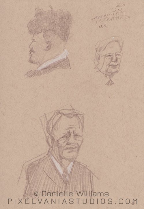 Ooooooo textured hair. And that guy down below was REALLY hard to hear, his testimony just got softer…and softer…and softer….
Made me feel for my dad, who has hearing problems and can’t hear a word in church. 😛
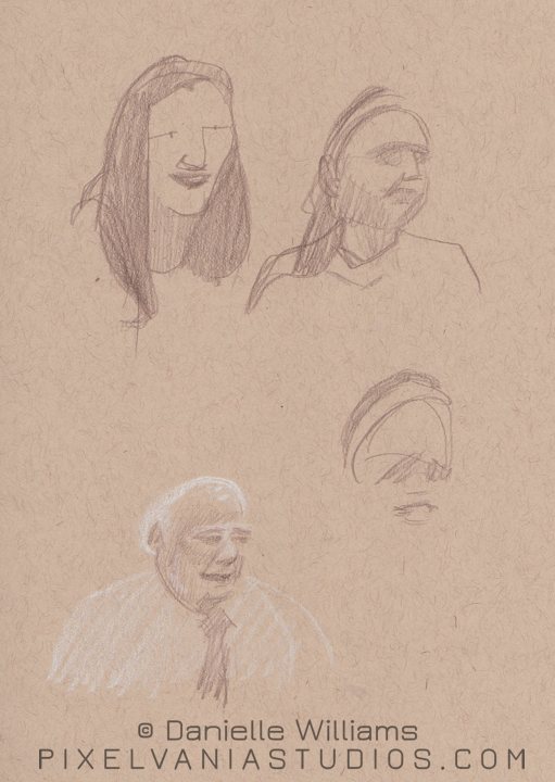 More from our new ward. The gentleman below just occurred to me as being so pale, I started him off all in white pencil.
Slight caricaturing may have happened on the topmost lady.